What is CSS clamp()?
Modern responsive design is no longer just about media queries. CSS now provides powerful native functions that make layouts smarter, cleaner, and easier to maintain.
One of the most useful modern CSS functions is clamp().
The clamp() function allows developers to define a responsive value with:
A minimum value
A preferred fluid value
A maximum value
Basic syntax:
font-size: clamp(minimum, preferred, maximum);Example:
font-size: clamp(16px, 4vw, 40px);This means:
The font size will never go below
16pxIt will scale fluidly using
4vwIt will never exceed
40px
This approach helps create truly fluid and responsive interfaces without writing multiple breakpoints.
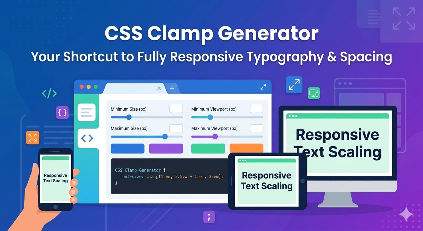
Try Our Free CSS Clamp Generator Tool
Creating perfect clamp values manually can sometimes be confusing, especially when calculating responsive scaling between screen sizes.
That’s why we created a free tool:
You can instantly generate responsive clamp() values for:
Font sizes
Margins
Padding
Widths
Heights
Gaps
Layout spacing
The tool automatically calculates fluid scaling values and gives you production-ready CSS code.
Why CSS clamp() is Important in Modern Web Design
Before clamp(), developers usually relied on:
Multiple media queries
Hardcoded breakpoints
Separate desktop/mobile font sizes
This often created:
Bloated CSS
Difficult maintenance
Inconsistent scaling
With clamp(), you can create smoother and more scalable UI systems.
Benefits include:
1. Cleaner CSS
You can reduce dozens of media queries into a single line.
2. Better Responsive Design
Elements scale naturally across screen sizes.
3. Improved Accessibility
Text remains readable across devices.
4. Faster Development
Fluid values are easier to manage and maintain.
Real-World CSS Clamp Examples
Responsive Typography
One of the most common use cases.
h1 {
  font-size: clamp(32px, 5vw, 72px);
}
This creates headings that smoothly scale between mobile and desktop.
Result
Small screens →
32pxLarge screens →
72pxBetween them → fluid scaling
Responsive Paragraph Text
p {
  font-size: clamp(16px, 1.5vw, 20px);
}
This keeps text readable on all devices without needing breakpoints.
Responsive Padding
.section {
  padding: clamp(20px, 5vw, 80px);
}
Perfect for creating fluid sections in landing pages.
Responsive Gap in Flex/Grid Layouts
.container {
  gap: clamp(12px, 2vw, 32px);
}
This automatically adjusts spacing between cards or grid items.
Responsive Width
.card {
  width: clamp(280px, 50vw, 500px);
}
Useful for cards, modals, and content containers.
Building a Fluid Typography System
A scalable typography system is one of the best uses of clamp().
Example:
:root {
  --fs-xs: clamp(12px, 1vw, 14px);
  --fs-sm: clamp(14px, 1.2vw, 16px);
  --fs-md: clamp(16px, 1.5vw, 20px);
  --fs-lg: clamp(24px, 3vw, 40px);
  --fs-xl: clamp(32px, 5vw, 72px);
}
Usage:
h1 {
  font-size: var(--fs-xl);
}

h2 {
  font-size: var(--fs-lg);
}

p {
  font-size: var(--fs-md);
}
This creates a consistent and maintainable design system.
CSS Clamp vs Media Queries
Traditional Media Query Approach
h1 {
  font-size: 32px;
}

@media (min-width: 768px) {
  h1 {
    font-size: 48px;
  }
}

@media (min-width: 1200px) {
  h1 {
    font-size: 72px;
  }
}
Modern Clamp Approach
h1 {
  font-size: clamp(32px, 5vw, 72px);
}
The clamp version is:
Cleaner
Easier to maintain
More fluid
Better for scalable design systems
How to Generate Perfect Clamp Values
Manually calculating clamp formulas can take time.
You need to consider:
Minimum viewport width
Maximum viewport width
Desired scaling
Unit conversion
Instead of doing calculations manually, use our:
Simply enter your values and instantly copy the generated CSS.
Using CSS Clamp with Tailwind CSS
You can also use clamp values directly inside Tailwind CSS.
Example:
<h1 class="text-[clamp(32px,5vw,72px)]">
  Responsive Heading
</h1>
This is especially useful for:
Modern landing pages
SaaS dashboards
Portfolio websites
Marketing websites
Best Practices for CSS Clamp
Keep Minimum Values Readable
Avoid making text too small on mobile devices.
Good:
font-size: clamp(16px, 2vw, 24px);Bad:
font-size: clamp(8px, 2vw, 24px);Avoid Extreme Maximum Values
Very large scaling can break layouts on ultra-wide screens.
Combine with CSS Variables
CSS variables help maintain consistency across projects.
Test Across Devices
Always test fluid scaling on:
Mobile
Tablet
Laptop
Large desktop screens
Common Mistakes Developers Make
Overusing Viewport Units
Using only vw can create unreadable text.
Bad:
font-size: 8vw;Better:
font-size: clamp(18px, 4vw, 48px);Ignoring Accessibility
Text should remain readable for all users.
Using Random Values
A design system should maintain proportional scaling.
Final Thoughts
CSS clamp() is one of the most powerful modern CSS features for responsive design. It simplifies fluid typography, spacing, and layout scaling while reducing the need for excessive media queries.
Whether you are building:
SaaS dashboards
Landing pages
Blogs
E-commerce websites
Design systems
clamp() can significantly improve your workflow and responsive UI quality.
To make development even faster, try our free:
Generate responsive CSS instantly and build cleaner, more scalable interfaces.
Frequently Asked Questions (FAQs)
What does CSS clamp() do?
CSS clamp() allows you to set a responsive value using:
Minimum value
Preferred fluid value
Maximum value
It helps elements scale smoothly across different screen sizes.
Example:
font-size: clamp(16px, 4vw, 48px);Why is CSS clamp() better than media queries?
clamp() reduces the need for multiple media queries by creating fluid scaling automatically.
Benefits include:
Cleaner CSS
Easier maintenance
Better responsiveness
Smoother scaling between screen sizes
Can I use CSS clamp() for spacing?
Yes. clamp() works great for:
Padding
Margin
Gap
Width
Height
Border radius
Example:
padding: clamp(16px, 4vw, 64px);Is CSS clamp() supported in modern browsers?
Yes. CSS clamp() is supported in all major modern browsers including:
Chrome
Firefox
Safari
Edge
It is widely used in modern responsive web design.
How do I calculate clamp values?
You can calculate clamp values manually using viewport formulas, but it can become time-consuming.
Instead, use our free tool:
It instantly generates production-ready responsive CSS values.
Can I use CSS clamp() with Tailwind CSS?
Yes. Tailwind supports arbitrary values, so you can directly use clamp().
Example:
<h1 class="text-[clamp(32px,5vw,72px)]">
  Responsive Title
</h1>
Is CSS clamp() good for typography systems?
Absolutely. clamp() is ideal for creating scalable typography systems that adapt smoothly across devices.
Example:
--fs-xl: clamp(32px, 5vw, 72px);This helps maintain consistency in responsive design systems.
Can CSS clamp() replace media queries completely?
Not entirely.
clamp() is excellent for fluid sizing, but media queries are still useful for:
Layout changes
Navigation behavior
Component restructuring
Complex responsive interactions
The best approach is often combining both techniques.
What units should I use inside clamp()?
Commonly used units include:
pxremvw%
Most developers combine fixed units with viewport units.
Example:
font-size: clamp(1rem, 2vw, 3rem);What are common mistakes when using CSS clamp()?
Some common mistakes include:
Using values that are too small
Overusing viewport units
Creating excessive scaling
Ignoring accessibility
Always test your UI across multiple screen sizes.
Is there a free CSS Clamp Generator available?
Yes.
You can use our free online tool here:
It helps generate responsive clamp() values quickly and accurately for modern web projects.