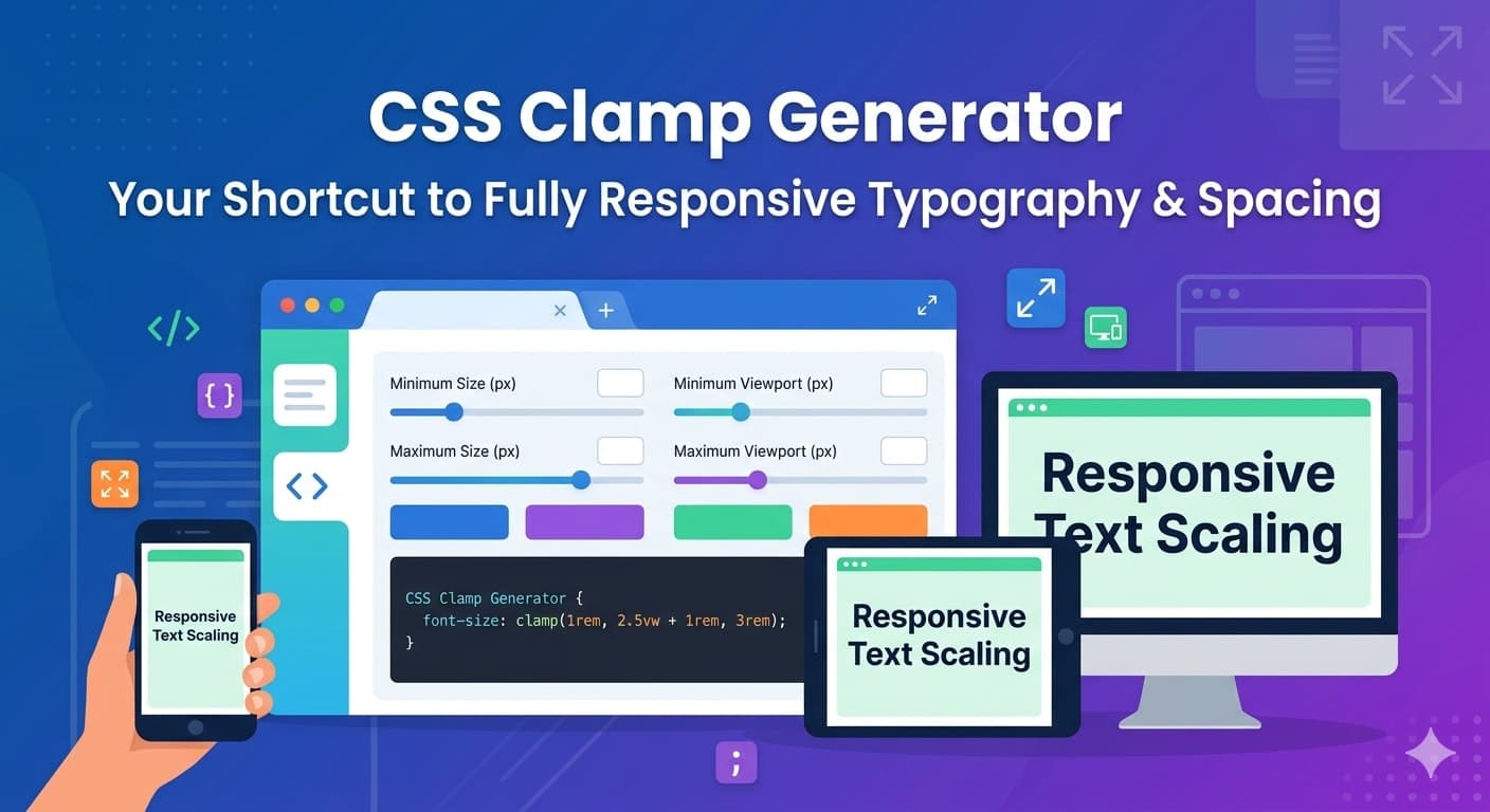
CSS Clamp Generator: Build Fully Responsive Typography & Spacing with Ease
Learn how to use CSS clamp() to create fluid typography, responsive spacing, and scalable layouts without endless media queries. This guide includes practical examples, real-world tutorials, and a free CSS Clamp Generator tool to speed up your workflow.
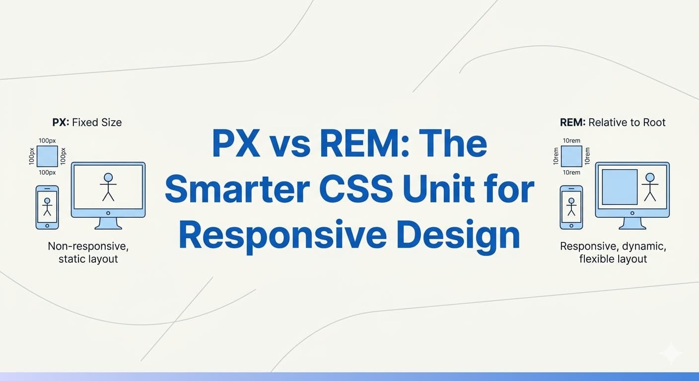
PX to REM in CSS: Why REM is Better for Modern Responsive Design
Learn the difference between PX and REM units in CSS, why REM is considered better for scalable and accessible web design, and how to convert PX to REM with practical examples, formulas, and real-world use cases.
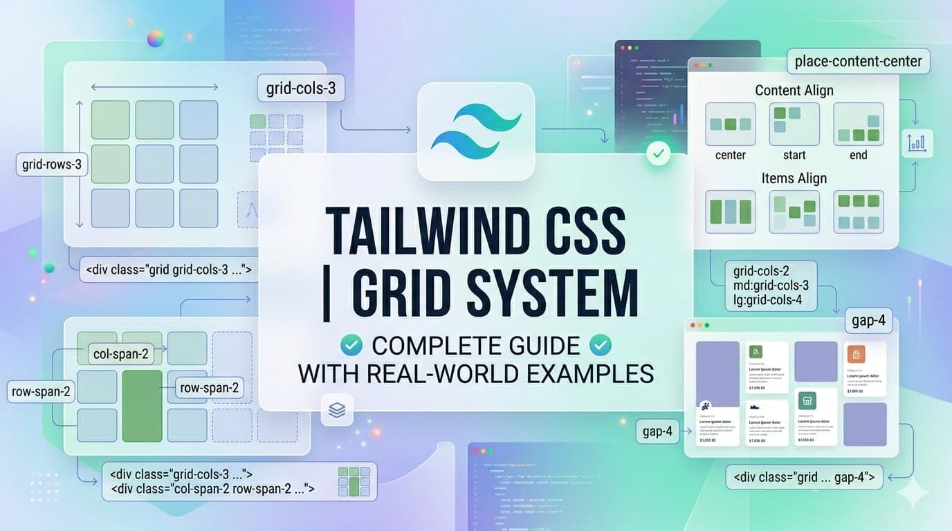
Part 8: Tailwind CSS Grid System Explained with Real-World Examples
Learn how to use Tailwind CSS Grid system with practical real-world examples like dashboards, e-commerce layouts, and blog designs. Perfect for beginners to advanced developers.
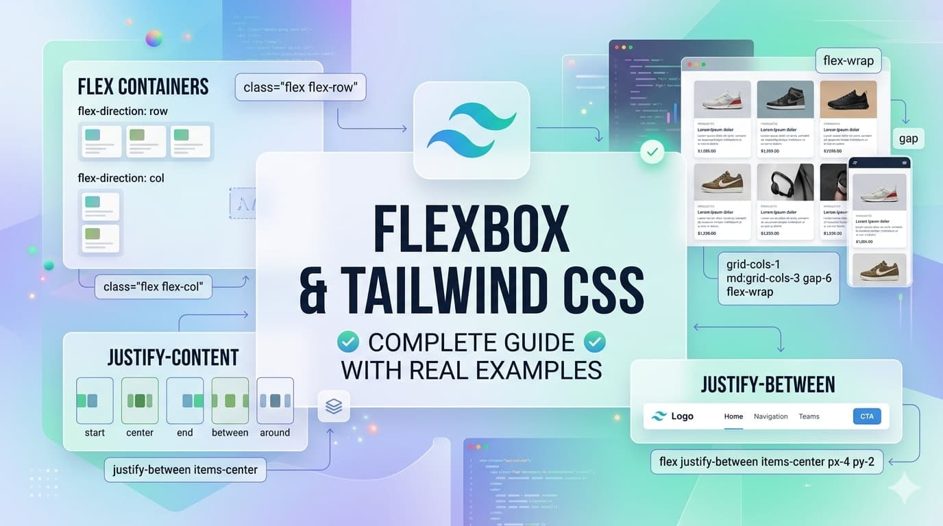
Part 7: Flexbox with Tailwind CSS: Complete Guide with Real Examples
Master Flexbox in Tailwind CSS with practical, real-world examples. Learn how to build responsive layouts, align items, and create modern UI components easily.
Part 4: How to Build a Responsive Navbar Using Tailwind CSS (Next.js Example)
Learn how to build a modern, fully responsive navbar using Tailwind CSS in Next.js with mobile-friendly design and clean utility classes.
Part 1: Tailwind CSS Introduction: What It Is & Why Developers Love It
Learn what Tailwind CSS is, how it works, and why developers love using this utility-first framework for building modern, responsive websites faster.
🎉 Get Your Daily Dose of Inspiration!
Join thousands of curious minds discovering awesome content every day. No spam—just the good stuff!